Difference between revisions of "Logo and branding"
| (3 intermediate revisions by 2 users not shown) | |||
| Line 1: | Line 1: | ||
| − | [[File:MakeICT-wallpaper-light.png| | + | [[File:MakeICT-wallpaper-light.png|center|600px]] |
== Signature Elements and Lock-Ups == | == Signature Elements and Lock-Ups == | ||
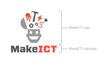
The MakeICT signature is a lock-up of 2 elements: the Logo and the Logotype | The MakeICT signature is a lock-up of 2 elements: the Logo and the Logotype | ||
| − | [[File:Lockup-vertical.png]] | + | [[File:Lockup-vertical.png|center]] |
This combination of elements is referred to as a lock-up, as it locks these elements together, in a prescribed scale and relationship to each other that prevents the independent altering of elements. | This combination of elements is referred to as a lock-up, as it locks these elements together, in a prescribed scale and relationship to each other that prevents the independent altering of elements. | ||
| Line 10: | Line 10: | ||
The primary signature is a centered vertical lock-up. There is a secondary horizontal lock-up of the signature that can be used when limited space requires it, and it is included in the logo files. | The primary signature is a centered vertical lock-up. There is a secondary horizontal lock-up of the signature that can be used when limited space requires it, and it is included in the logo files. | ||
| − | [[File:Lockup-horizontal.png]] | + | [[File:Lockup-horizontal.png|center]] |
== Safe Zone == | == Safe Zone == | ||
| Line 19: | Line 19: | ||
see a guide delineating this area when opened with Adobe Illustrator. | see a guide delineating this area when opened with Adobe Illustrator. | ||
| − | [[File:safe-zones.png]] | + | [[File:safe-zones.png|center]] |
== Color == | == Color == | ||
The MakeICT visual identity uses three colors, specified below. | The MakeICT visual identity uses three colors, specified below. | ||
| − | {| class="wikitable" | + | {| class="wikitable" style="margin: auto;" |
| rowspan="3" | [[File:Logo-primary.svg]] | | rowspan="3" | [[File:Logo-primary.svg]] | ||
| <div style="width:4em; height: 4em; background: #97999b"></div> | | <div style="width:4em; height: 4em; background: #97999b"></div> | ||
| Line 36: | Line 36: | ||
|} | |} | ||
| − | |||
| − | |||
| − | |||
| − | [[File:One-color-logo-examples.png]] | + | 3-color works best on white backgrounds, for print and web use. For situations where a white background isn’t possible or desired, as is the case with shirts, the logo in 1-color is a good option. |
| + | |||
| + | [[File:One-color-logo-examples.png|center]] | ||
== Type == | == Type == | ||
| − | [[File:Callout-logotype.png]] | + | [[File:Callout-logotype.png|center]] |
The MakeICT logotype is set in modified Vitesse Sans, making it custom and unique to MakeICT. Never try to reset, rebuild or approximate the logotype for this reason. | The MakeICT logotype is set in modified Vitesse Sans, making it custom and unique to MakeICT. Never try to reset, rebuild or approximate the logotype for this reason. | ||
| Line 49: | Line 48: | ||
With rare exception, the logotype should always appear with the logo as prescribed in the lock-ups — this is the most memorable and unique form of your identity, when it includes the robot head and maker objects. But in the event that space limitations or other extreme circumstances leave you without a choice, the MakeICT logotype could be used as a standalone mark. It is included in the logo files provided, so there is no need to alter or pull from the primary and secondary logo files. | With rare exception, the logotype should always appear with the logo as prescribed in the lock-ups — this is the most memorable and unique form of your identity, when it includes the robot head and maker objects. But in the event that space limitations or other extreme circumstances leave you without a choice, the MakeICT logotype could be used as a standalone mark. It is included in the logo files provided, so there is no need to alter or pull from the primary and secondary logo files. | ||
| − | [[File:MakeICT-Logotype.svg]] | + | [[File:MakeICT-Logotype.svg|center]] |
== Unacceptable usage == | == Unacceptable usage == | ||
| Line 56: | Line 55: | ||
The following examples illustrate unacceptable uses. | The following examples illustrate unacceptable uses. | ||
| − | [[File:unacceptable-logo.png]] | + | [[File:unacceptable-logo.png|center]] |
== Acceptable usage == | == Acceptable usage == | ||
| Line 71: | Line 70: | ||
== Downloads == | == Downloads == | ||
| + | |||
| + | |||
<gallery> | <gallery> | ||
Logo-primary.svg|Primary SVG | Logo-primary.svg|Primary SVG | ||
Logo-primary.eps|Primary EPS | Logo-primary.eps|Primary EPS | ||
| + | Logo-primary.png|Primary PNG | ||
</gallery><gallery> | </gallery><gallery> | ||
Logo-secondary.svg|Secondary SVG | Logo-secondary.svg|Secondary SVG | ||
| Line 81: | Line 83: | ||
Logo-type.eps|Logotype EPS | Logo-type.eps|Logotype EPS | ||
</gallery><gallery> | </gallery><gallery> | ||
| − | MakeICT-wallpaper-light.png|Light | + | MakeICT-wallpaper-light.png|Light wallpaper |
| − | MakeICT-wallpaper-dark.png|Dark | + | MakeICT-wallpaper-dark.png|Dark wallpaper |
| + | MakeICT-wallpaper-black.png|Black wallpaper | ||
</gallery> | </gallery> | ||
| + | |||
| + | === Printables === | ||
| + | * Sheet of "Made at MakeICT" Labels: https://drive.google.com/file/d/1XgWmj_UAtePyIzZW_hd1q27aSN6SKcU4/view?usp=sharing | ||
Latest revision as of 07:19, 5 November 2019
Contents
Signature Elements and Lock-Ups
The MakeICT signature is a lock-up of 2 elements: the Logo and the Logotype
This combination of elements is referred to as a lock-up, as it locks these elements together, in a prescribed scale and relationship to each other that prevents the independent altering of elements.
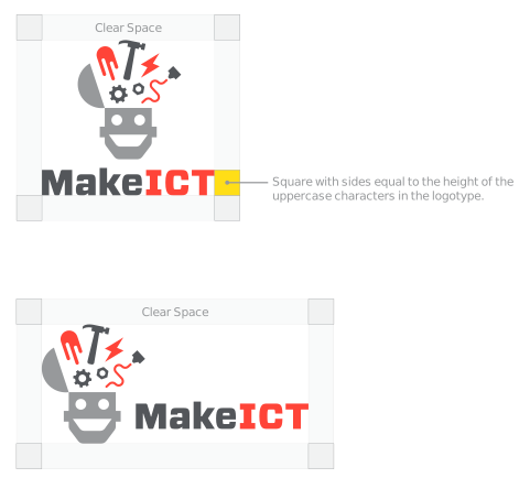
The primary signature is a centered vertical lock-up. There is a secondary horizontal lock-up of the signature that can be used when limited space requires it, and it is included in the logo files.
Safe Zone
Each lock-up of the signature should have a safe zone around it, ensuring clear space between the mark and other graphic elements. With very rare exceptions, this safe zone should be observed so your identity stands out.
Note: Safe zones are built into the provided files. In the vector files, you will see a guide delineating this area when opened with Adobe Illustrator.
Color
The MakeICT visual identity uses three colors, specified below.

|
Pantone Cool Gray 7 (coated) #97999b R=151 G=153 B=155 | |
| Pantone Cool Gray 11 (coated) #53565a R=83 G=86 B=90 | ||
| Pantone Warm Red (coated) #ff4438 R=255 G=68 B=56 |
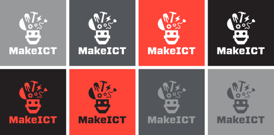
3-color works best on white backgrounds, for print and web use. For situations where a white background isn’t possible or desired, as is the case with shirts, the logo in 1-color is a good option.
Type
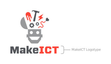
The MakeICT logotype is set in modified Vitesse Sans, making it custom and unique to MakeICT. Never try to reset, rebuild or approximate the logotype for this reason.
With rare exception, the logotype should always appear with the logo as prescribed in the lock-ups — this is the most memorable and unique form of your identity, when it includes the robot head and maker objects. But in the event that space limitations or other extreme circumstances leave you without a choice, the MakeICT logotype could be used as a standalone mark. It is included in the logo files provided, so there is no need to alter or pull from the primary and secondary logo files.
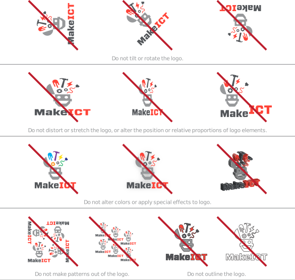
Unacceptable usage
It is highly important for maintaining a successful brand that the MakeICT logo and its signatures be handled and displayed properly and consistently.
The following examples illustrate unacceptable uses.
Acceptable usage
Always:
- Scale the entire logo uniformly.
- Use the logo in an unaltered state, as it was furnished in the files.
- Observe the safe zone.
- Make sure the background has proper contrast with the logo.
The exception to the rules:
With all these rules, how are you supposed to have any fun?! Well, it’s worth pointing out that these rules are just for official MakeICT branded materials that appear in print and web, signage, etc., where it is important for the logo to be on display in a clear and consistent manner. Following the rules strengthens your brand recognition. But that doesn’t mean your members can’t have fun with it, and you can’t break the rules yourself in special circumstances. Is it an outline if you make it out of wire or neon lights? Or is it a forbidden special effect to route the logo out of a giant slab of wood or cut it out of foam or print it in 3D? That’s a stretch, to police the logo’s use in all situations, so don’t take it too far. Use your best judgment.
Downloads
Printables
- Sheet of "Made at MakeICT" Labels: https://drive.google.com/file/d/1XgWmj_UAtePyIzZW_hd1q27aSN6SKcU4/view?usp=sharing

